I tried Amie, the productivity app that won a design award.
But I never found out what it looked like.
Onboarding stands out as one of the most important blockers to user activation and subsequent product adoption for a competitive market like productivity apps.
Given my recent endeavor to meaningfully explore the space of productivity systems + recommendations online and from friends, I attempted to give Amie a go.
Here's a summary of this read:
- I had inflated expectations going in given their reputation for craft
- High friction onboarding, long time-to-value with no payoffs
- They collected preferences without showing relevance
- Great product features, but onboarding doesn't do them justice
I also very subjectively rate each section using an emoji:
- 🙂 (delightful)
- 😴 (alright/could be better)
- 👺 (bad/friction/dirty)
Amie
Amie started as a combo to-do list and calendar, and launched in 2022 with much fanfare, reaching #1 on Product Hunt and winning that year's Golden Kitty award. It's since become a full productivity suite, adding notes, files, AI scheduling, and more.
I signed up for Amie with my Google account and entered its onboarding flow. The experience really starts at auth, before users even have the chance to enter your app.
1. Auth 😴
Google's new granular controls list out all the information Amie wants to access, so that's four on top of the usual.
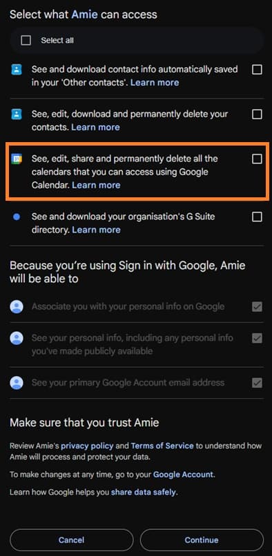
Reading carefully, Amie wants contact info, calendar access, and... wait. My organization's G Suite directory?
I figured that I'd only tick the calendar box, and surprisingly, it let me through.
2. Questionnaire 👺
Rough start. I got hit with two unskippable questionnaire screens immediately:
2.1 Persona screening
The first screen was a typical persona question - what are you using Amie for? (personal vs. work vs. school)
Product person hat on, my first thought was that Amie was trying to price segment me for a subsequent screen.
Clicking any of the options had no feedback, and hitting next didn't work either.
2.2 Benefits I expect from Amie
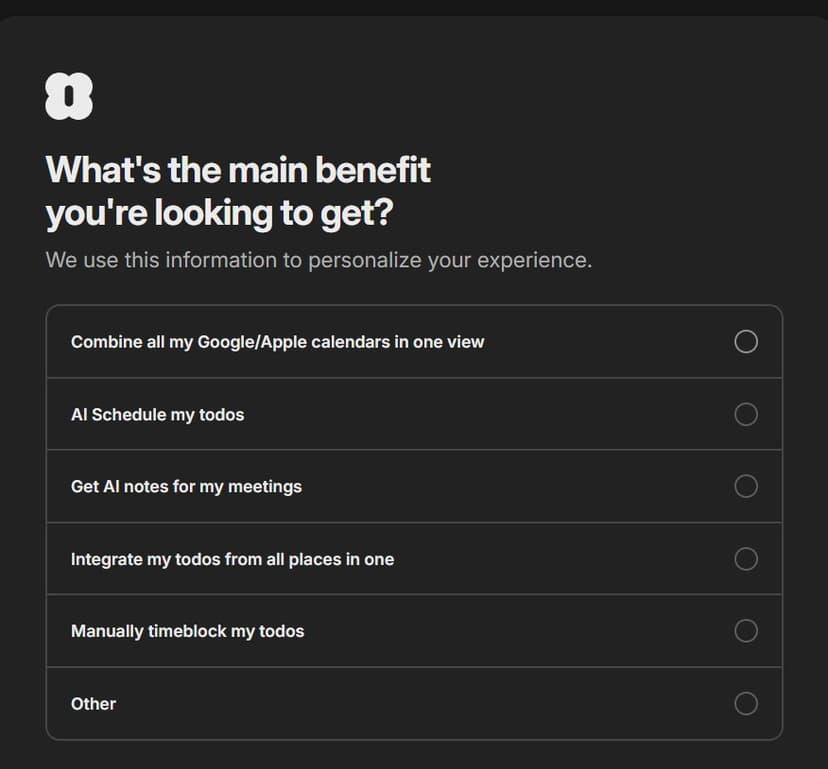
For the second screen, clicking any of the options similarly had no payoff.
The brilliant part about this screen is that it forced me to internalize all of Amie's core features and select only the top one.
Overall, there was no payoff for answering these questions, and I was left wondering why Amie needed this information in the first place.
3. Calendar import 🙂
Pretty self-explanatory. I imported all my calendars from Google.
The right-most column hints at their AI scheduling feature, and that Amie respects your existing commitments.
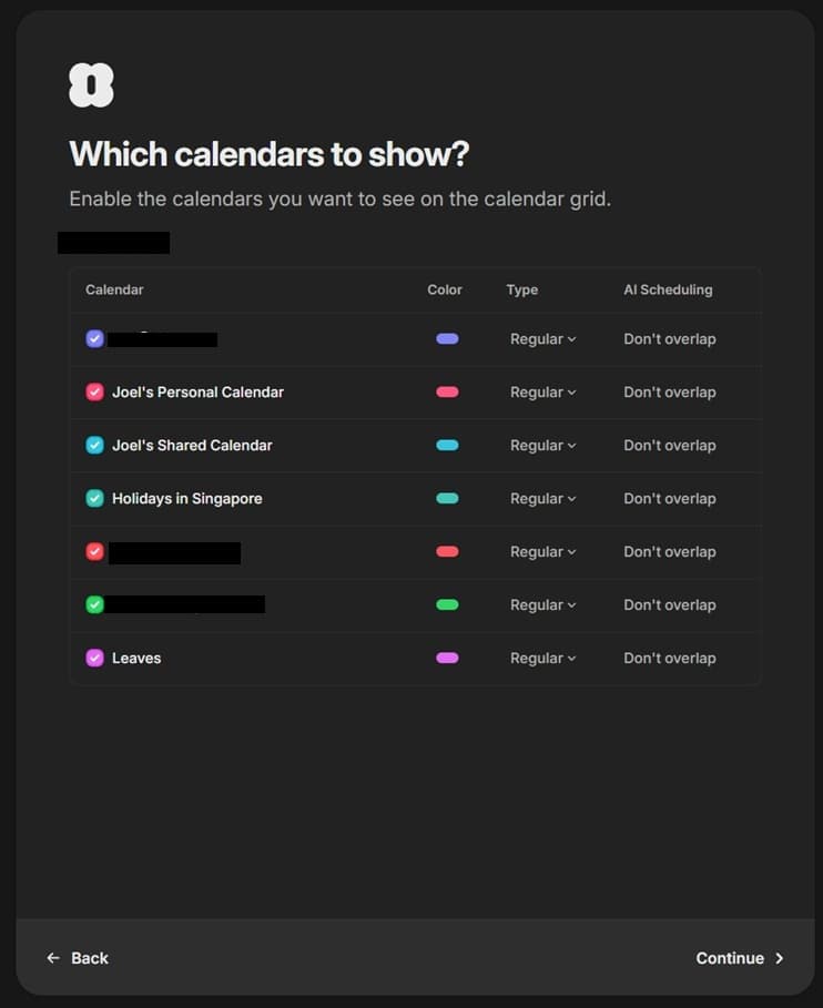
I didn't notice it immediately, but the colors displayed matched my colors on Google Calendar. The moment of delight only came when I realized this afterward, so there might be a better way to get users to make an immediate connection.
I'm thinking - if there's a climax at the end of this onboarding, I've just hit the start of the ramp (but it's already taken 8+ clicks to get here!)
There was also a dropdown to select between Regular and Background calendars.
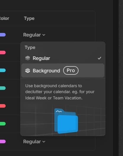
There's not much explanation, but I sort of got it. I chalked it up to Amie trying to subtly introduce Regular and Pro plans, but it seemed like a pretty weird, out-of-place way to do it.
4. Import contacts 😴
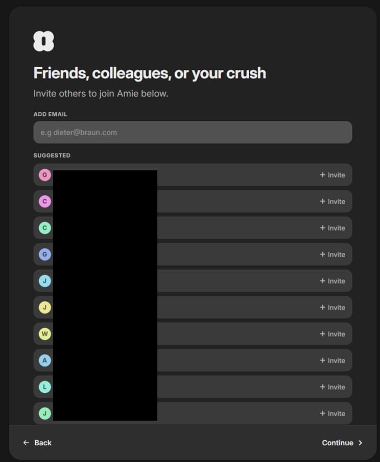
Ah, so this is why Amie wanted to know who my friends are. This is the first time we understand that Amie is a social app.
Not much to say here, but I think it's unclear why I need to invite friends at this point.
5. Integrations 🙂
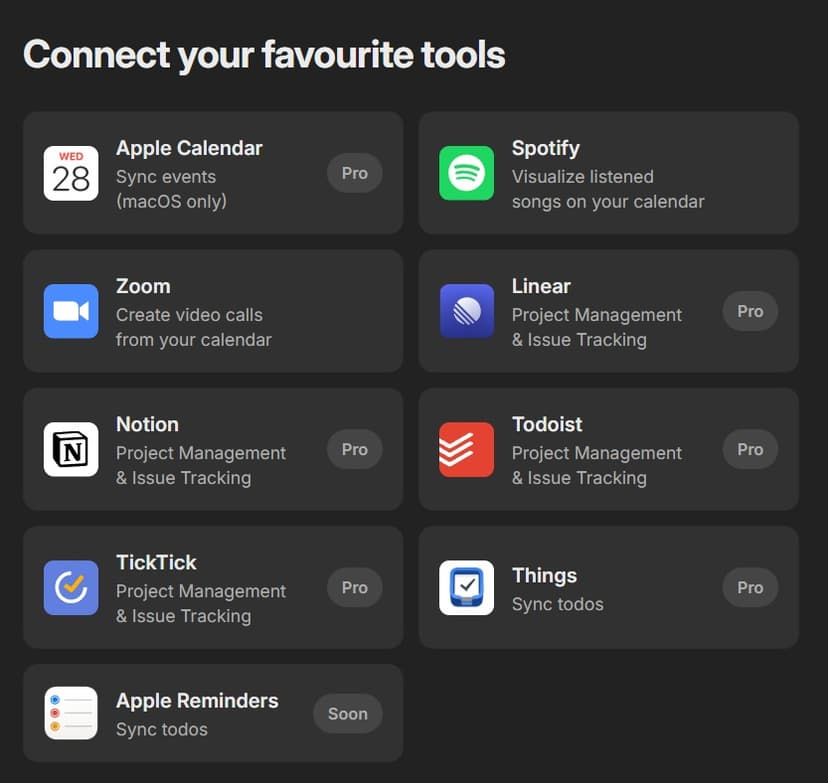
This is one of the best screens in this onboarding flow. It shows off integrations with clearly articulated actions.
Integrations for work productivity are clearly marked Pro, but for poor me who clicked Personal Use, it comes across as slightly irrelevant.
Hiding at the bottom is a "What integration should come next?" button, which loaded up a bunch of existing requests for me to vote on.
If I were to design it, I'd put all of current + soon + future (vote) in a scrollable list, so I can see what the Amie team will ship in the next couple of months, should I commit.
6. AI Scheduling (the dark ages begin) 👺
...followed by one of the worst screens of the flow.
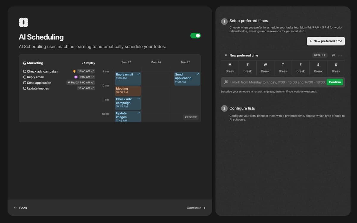
After a 3 second wait watching the left panel animation play out, two options appear on the right.
6.1 Setup preferred times
The first appears to want me to specify preferred times for AI scheduling, but the copy was a little confusing.
"Choose when to schedule your tasks" - Am I choosing when to schedule my tasks, or when Amie should schedule my tasks, or what blocks of time I'm allowing Amie to touch?
Anyway, I created a new preferred time and a table and input field appeared. It's a pretty low-risk tutorial that teaches the user to prompt Amie, then expect a visual response on the calendar.
About this time, I noticed some extra menu actions on the cards that appeared. "Create booking link" didn't help at all.
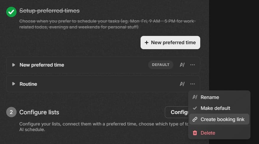
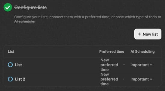
6.2 Configure lists
This one was ultra confusing for me. What's a list? List of events? To-do list?
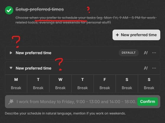
7. Scheduling link 👺
The next screen is titled scheduling link, but asks me if I want to enable or disable preferred times.
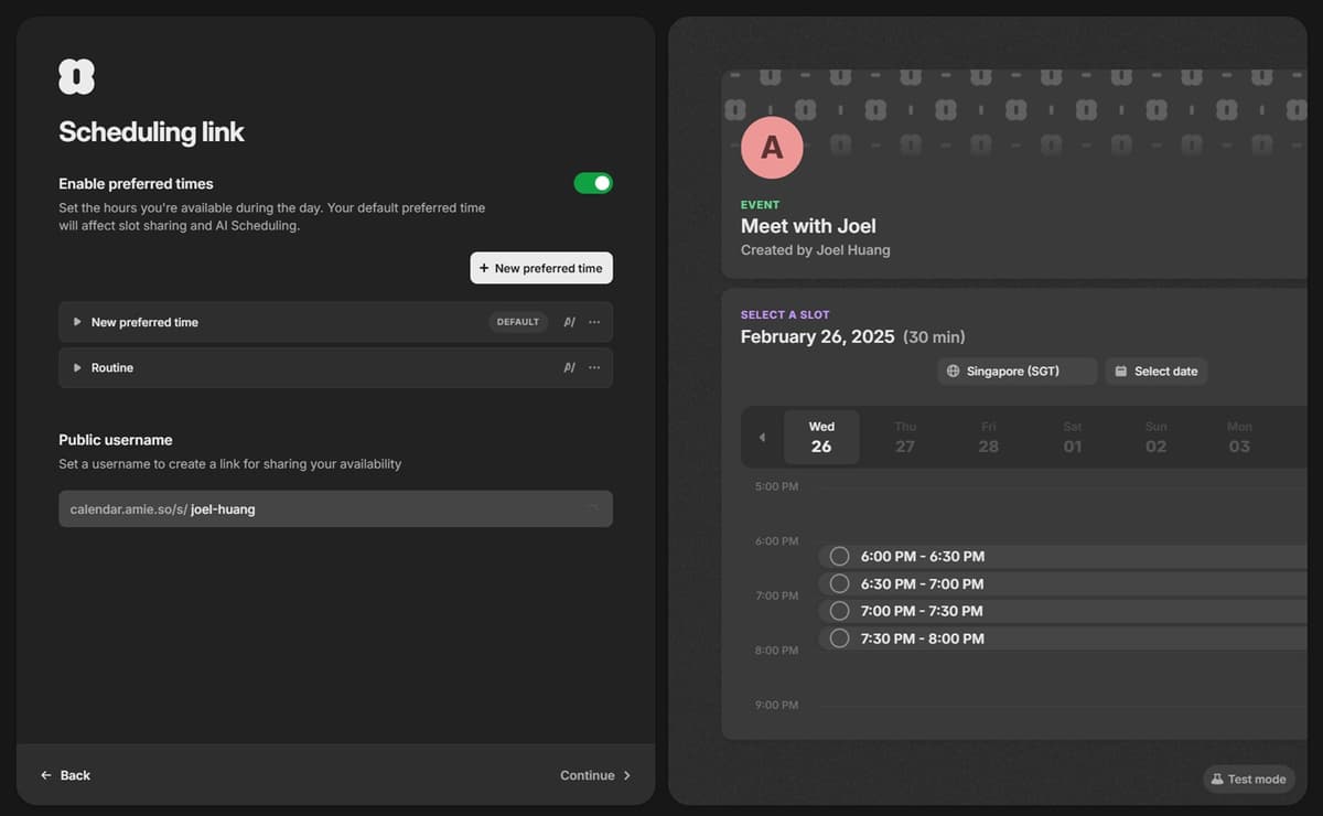
I thought I just set them up?
At this point, I still don't know what preferred times are and I'm getting super impatient.
The meet with preview on the right doesn't really say anything useful.
*There was actually one more screen in between this and Pricing, but I didn't take a screenshot (it asks you to download the iOS app, or vote for Android otherwise).
8. Pricing (the climax??) 👺
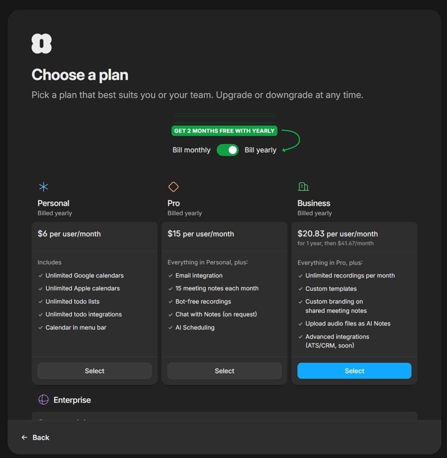
We get a typical pricing card stack, which doesn't seem to remember I selected Personal Use. Instead, the business plan button is accented to draw attention to it.
If you scroll back up to read my thoughts when I was answering the questionnaire, I was thinking that it would set up some kind of payoff here, like using all the info I provided over the course of the onboarding to make Personal an irresistible offer, with an upsell opportunity for Pro.
At this point, I was pretty frustrated with the onboarding flow, so I didn't bother to continue (let alone drop $6 for a month's trial) and churned out.
What I'd change
Overall, Amie's design was pleasant to look at and I had small moments of delight throughout the flow (but I was also searching really hard for them).
I still want to believe Amie has a great product, but I might never find out.
Here's the top 3 things I'd change about their onboarding flow:
- Reduce, reduce, reduce time to value. I spent 10 minutes and ended up confused and I still don't know what Amie looks like, or what my life would be like with it.
- Fair exchange of information. Every piece of information we ask for is an opportunity to describe our value to the user.
- Make me do, don't make me think. Learning new jargon (e.g. "Preferred Times") during onboarding is extremely high friction.
I left the onboarding flow less trusting in Amie's ability to reduce my cognitive overhead (vs. their promise of productivity).
It's a missed opportunity for meaningful demonstration of value and emotional connection—otherwise allowing potential users like myself to discover the promise that earned them their accolades in the first place.